Get an insight of the quality of your ground measurements
Get an insight of the quality of your ground measurements |
 |
The 4 graphs used for the analysis |
(++): advantages
(--): limits
"One-day graph"
|
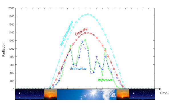
"One-day graph": visualize the data one day after the other is essential to spot particular issues in the data.
When x (time) is close to zero, this is night time and all radiation values are equal to zero. Then sun is rising and radiation starts being received at the top of atmosphere (cyan), in cloud-free conditions (red), and in all-weather condition (blue is the estimation, and green the reference). Then, sunset, and night again.
|
|
"2D-view"
|
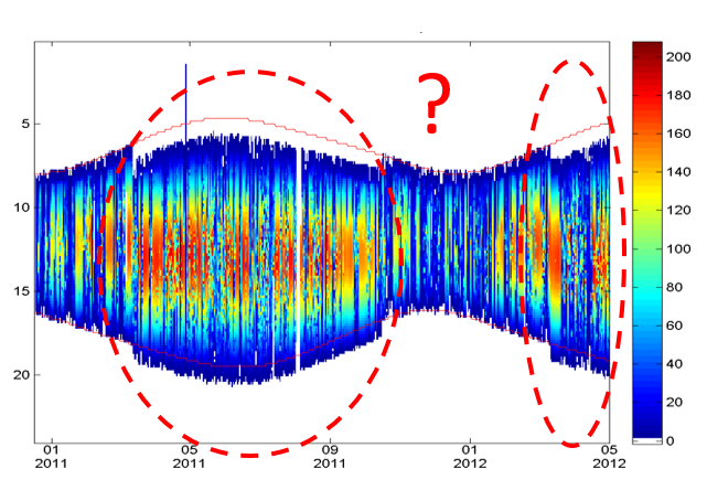
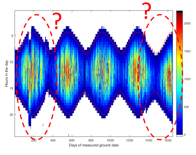
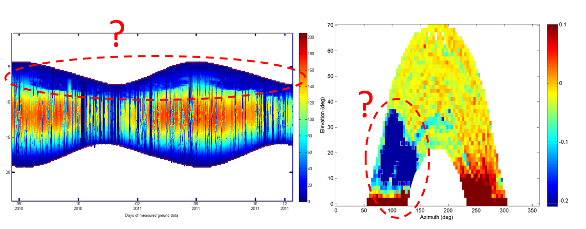
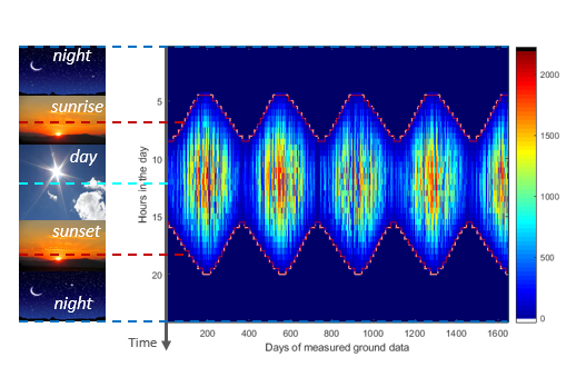
"2D-view": very convenient to visualize a dataset over the whole period of time at a single glance. Each one-day graph (as explained above) represents a column of this image. Dark blue is night values, other colors are radiation values above 0 with maxima in dark red. Red lines correspond to sunrise and sunset.
On the top of the image (time close to 0), this is the night, and radiation (colorbar on the right-hand side) is equal to zero. Then, when moving down on the image, one meets the red line corresponding to the moment when the sun is rising. Radiation reaches its maximum at noon True Solar Time if no cloud, to finally go down again until dusk (red line again). The shape observed on this "2D-view" is typical for mid-latitude locations in Northern hemisphere. When the day are short (for day around "0", "380", "750", "1100", and "1480" on this graph), this is winter time. Longest days correspond to summer time.
|
|
"Shadow map"
|
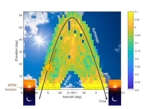
"Shadow map": maybe one of the more powerful (but complex to explain :o) ) tool to explore shadows (or masking) on measurements. This graphs depicts the log10 of the ratio of the two cumulative radiation values time series (typically ground measurements/estimation).
This graph is very intuitive in the sense that each bin (pixel) corresponds to the exact position of the sun at one instant. It is as if an observer was lied down on the earth surface watching the sun at each instant and putting the quantity of energy (or power) in each corresponding box. The value inside each box is less intuitive (log10 of the ratio of the two cumulative radiation values). Most of the time, the value corresponds to the log10 of the ground measurements divided by any measurement that you know in advance that they don't face any nearby shadowing effect due to for instance trees, buildings or other in-situ measuring devices.
|
|
"2D-histogram"
|
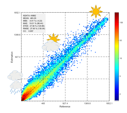
"2D-histogram": this graph is the most common way to compare a dataset (an estimation) with another one (typically a reference). Each bins (or colored pixel, with colobar on the right-hand side) is a cumulative count of instants for a given radiation level.
When both datasets are perfectly coincident, all points are located along the y=x line. The further from this line, the less the estimation is capable of representing the reference. Night values are discarded before plotting.
|
 |
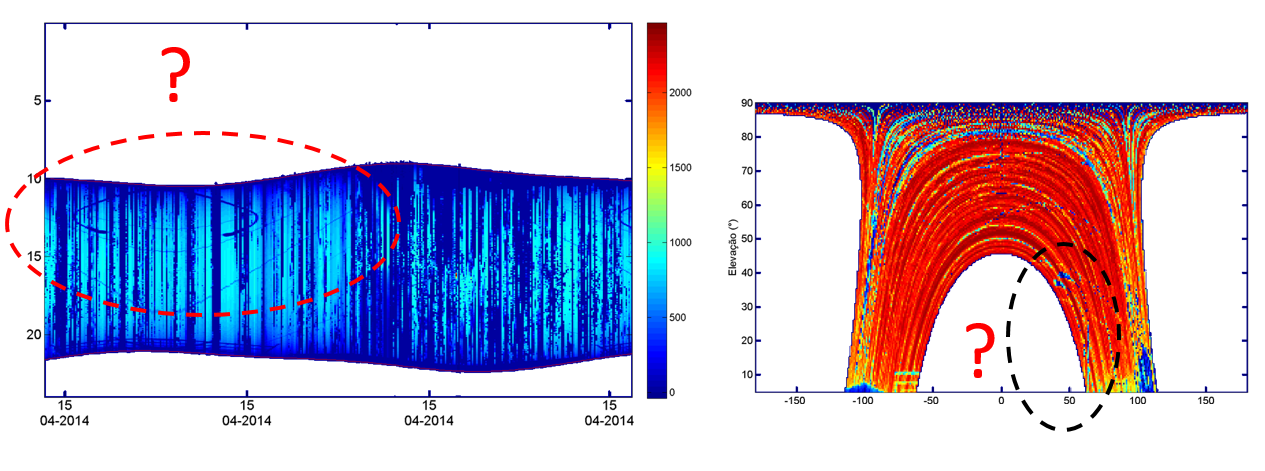
QUIZZ: Let's play a little game. Would you be able to find what's going on with these data? |
Reminder: by default, we read the data in UT (Universal Time).
|
|
(Click on the button to get the solution) |
|
|
|
 |
|
 (Click on the image to magnify) |
 |
|
 (Click on the image to magnify) |
 |

 , intermediate
  , or cloudy/rainy
  ).
).